All those free internet services we enjoy? This is how they get paid for. Remember, if you’re not paying for the product, you are the product.

Found via Cool Infographics
All those free internet services we enjoy? This is how they get paid for. Remember, if you’re not paying for the product, you are the product.
Found via Cool Infographics
Cool chart from Quartz that helps visualize unemployment rates and what’s included / not included in the official unemployment rate and the broader, U6 measure:


Source: Information is Beautiful
A slightly better chart than the one I posted in my Mt. Bernanke post:

“Bull markets are born on pessimism, grown on skepticism, mature on optimism and die on euphoria.” -Sir John Templeton
The article this chart is from is worth a read: Stages in a Bubble – below is the introductory paragraph.
Business cycles are a well understood concept commonly linked with technological innovations, which are often triggering a phase of investment and new opportunities in terms of market and employment. The outcome is economic expansion and as the technology matures and markets become saturated, expansion slows down. A phase of recession is then a likely possibility as a correction is required to clear the excess investment or capacity that irremediably occur in the later stages of an economic cycle. The bottom line is that recessions are a normal condition to a market economy as they are regulating any excess, bankrupting the weakest players or those with the highest leverage. However, one of the mandates of central banking is to fight a process (business cycles) that occurs “naturally”. The interference of central banks such as the Federal Reserve appear to be exaggerating the amplitude of bubbles and the manias that fuel them. It could be argued that business cycles are being replaced by phases of booms and busts, which are still displaying a cyclic behavior, but subject to much more volatility. Although manias and bubbles have taken place many times before in history under very specific circumstances (Tulip Mania, South Sea Company, Mississippi Company, etc.), central banks appear to make matters worst by providing too much credit and being unable or unwilling to stop the process with things are getting out of control (massive borrowing). Instead of economic stability regulated by market forces, monetary intervention creates long term instability for the sake of short term stability.
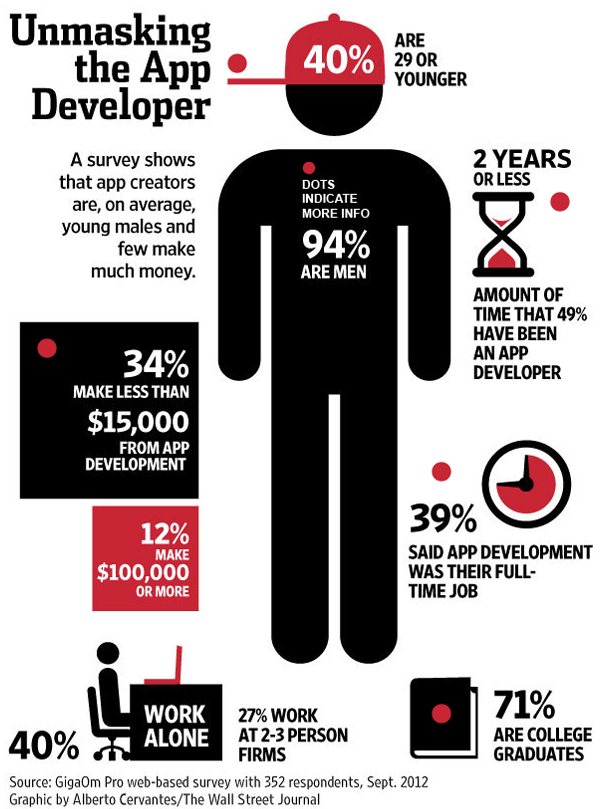
Nice infographic from the WSJ for their article on messaging apps – check it out here. They say that on average few app developers make much money, which was a surprise to me. Every startup I’ve worked with / talked to over the last 2 years routinely complains about a shortage of talent – mobile app development is particularly problematic because you have to develop for multiple platforms (iOS, Android, and to a lesser extent Windows, and Blackberry) you’re not just designing one web page accessible by any device.
A very sobering infographic carrying a lot of information. Can you imagine if you had to carry all the water you used? Also, the cost of providing global access to safe water is only $30 billion?
I know, that is a large huge number but when you put it in the context of the things our government wastes money on, it could easily fit in. When you consider the Iraq war cost us between $3.2-$4 trillion it really puts this number in perspective – we could have provided safe drinking water to everyone on earth 106 times over for that cost – or completed the project one time for what about one month in Iraq cost us. Now that would win some hearts and minds. I digress.
SO – if you’re fortunate enough to be Water Rich try to take shorter showers, fix your leaky faucets, and don’t over-water your lawn. The more you save, the cheaper your beer will be.
 Source: Seametrics
Found via Coolinfographics
Below is a screenshot from an interesting inforgraphic about the current state of the news industry. A lot of interesting tidbits and takeaways but for some reason this one jumped out at me:

Infographic found via The Big Picture
Great infographic about Google’s various mobile products and how they’re monetized.
 Source: WordStream
Found via The Big Picture
“I’ll believe corporations are people as soon as Texas executes one”

Cool infographic from RMI on the SEO Tactics they used for their clients in 2012. They expect the chart to remain the same for much of 2013.
 Found via Cool Infographics